


During the course of this blog series, we’ve mentioned the importance of time again and again. This shouldn’t come as a surprise because nearly everything we do in security operations revolves around events with timestamps associated with them.
The funny thing about time is that when we move away from absolute time to relative time frames, definitions of those relative time ranges can sometimes lead to confusion.
If you are a Google Security Operations (SecOps) user and previously used the dashboard integration with Looker, some of this may not be new. But if you were a casual user of that functionality or digging into dashboards now, the time is right to understand relative time as you build dashboards.
Throughout this dashboarding mini-series, everything we have created is expressed in days. That’s not to say you can’t express time ranges in other units, it’s just what we’ve done.
Now, while talking about the number of events in the past day or the number of detections in the past 30 days sounds quite reasonable, understanding relative time and Google SecOps’s implementation is crucial. This is especially important if you are being tasked to create charts and dashboards for other users, particularly leadership.
Here’s why.
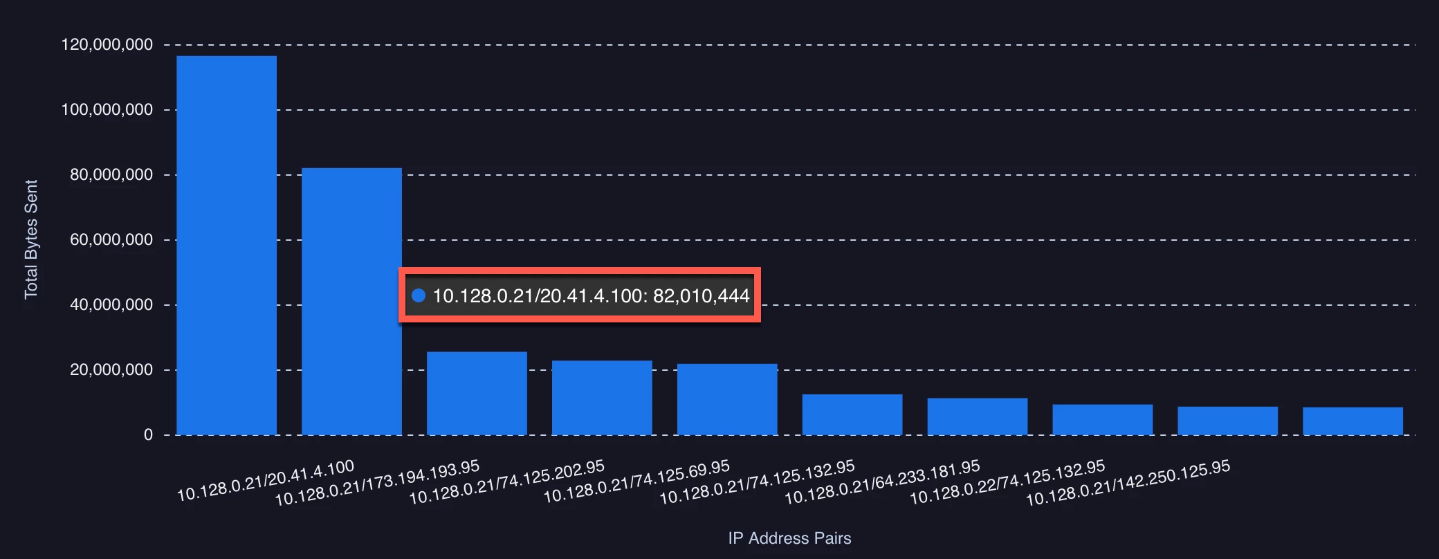
Let's look at the chart we previously created for Top Talkers - Sent Bytes. At the time, we specified relative time in days. Then, when we looked at filtering, we applied a dashboard filter of the past three days. This is all good stuff, this is a good example of why it’s important to be mindful of relative time, particularly when capturing user requirements.
This chart is Top Talkers - Sent Bytes with a relative time range of 24 Hours.
And this one is Top Talkers - Sent Bytes with a relative time range of 1 Day. Notice anything different?
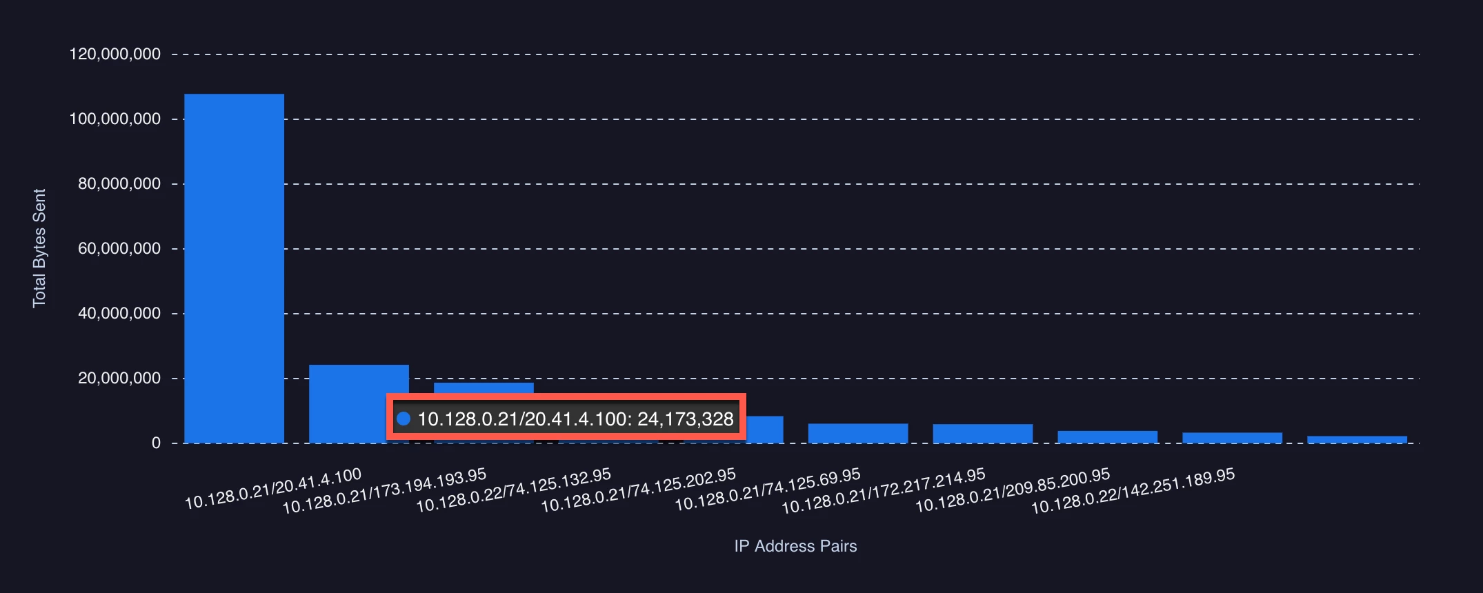
I highlighted one specific combination but clearly there is a difference between the past 24 hours and the past day.
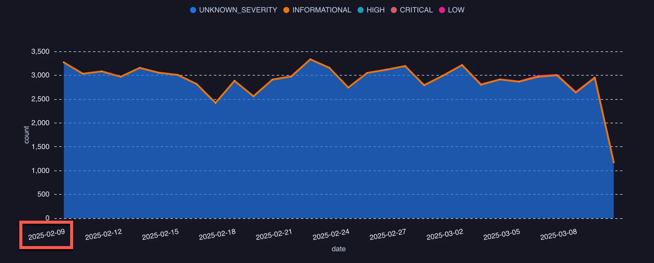
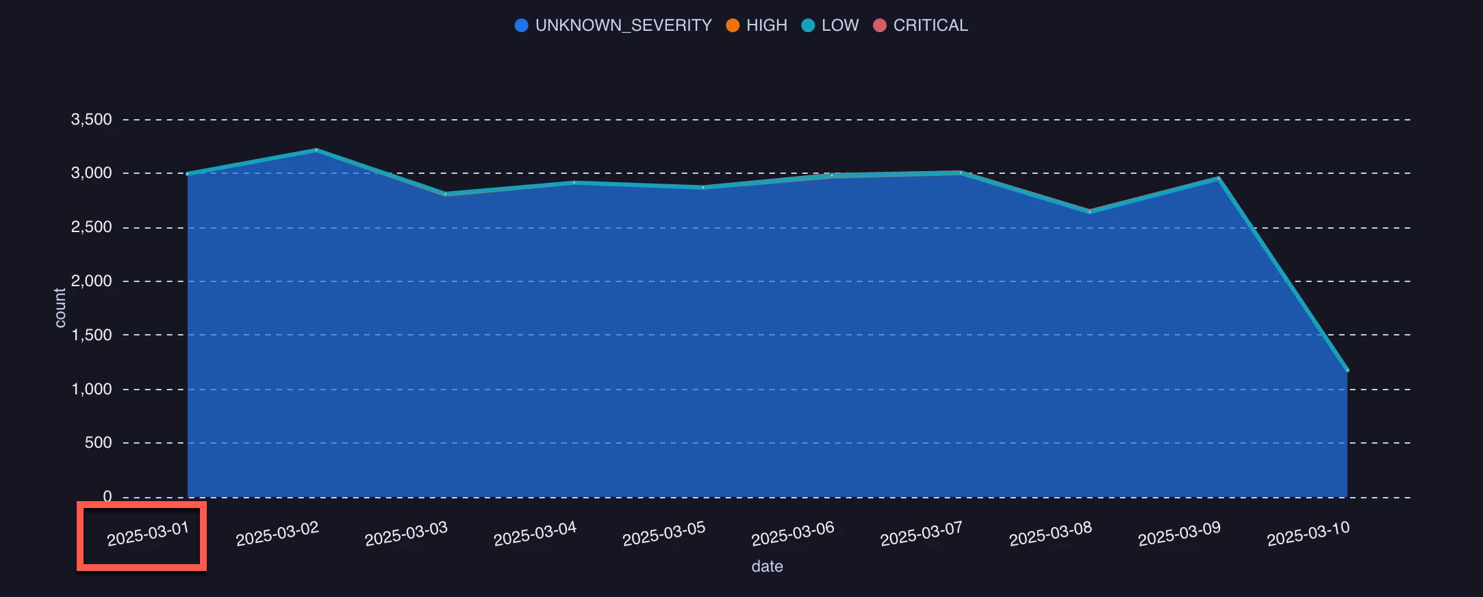
The difference in time unit becomes even more apparent, when applying time as part of our visualization. We previously built a detection time chart for the past 30 days. Here is what the chart looks like on March 10, as I write this blog.
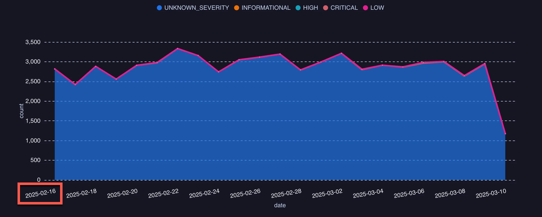
However, if I changed this to the past 4 weeks, even taking into account that February only has 28 days in it this year, I get a substantially different start date to my chart.
And if I built my detection chart for the past 1 month, it’s really different.
By now, you are likely realizing that the time unit is the driving factor in this calculation of relative time and this is what we need to be mindful of as we build our charts and dashboards. This is something we’ve experienced before with the timestamp.diff function where the time unit specified drives the calculated output.
Here’s a query that you can use with your own data to illustrate the differences in the output from different relative time units. I used process launch events but you can swap the event type to be anything you’d like.
$event_type = metadata.event_type
metadata.event_type = "PROCESS_LAUNCH"
match:
   $event_type
outcome:
   $current_time = timestamp.get_timestamp(timestamp.current_seconds(), "%c")
   $first_seen_time_range = timestamp.get_timestamp(min(metadata.event_timestamp.seconds), "%c")
All four of these queries were run within ten minutes or so of one another but with a different relative time range for each.
The past seven days are pretty straightforward. We can see that our time range is from March 4 to March 10, the day I started writing this blog. However, take note that the day is anchored to the time 00:00:00. When using the past 1 week, this anchoring is to Sunday at 00:00:00. This could really change the results of the chart depending upon the intent. This query, run on March 10, will result in the range being the start of that week and could return a much more narrow data set.
Keeping in mind the time frame of this test, applying the same concept to the last four weeks will return data going back as far as February 16, though because the week starts on Sunday, we really are left with three weeks and a day or so. On the other hand, this is much better than the past 1 month, which anchors on the first day of the month at 00:00:00 because that only provides us with the first 10 days in March.
The point to all of these examples is to make sure that when using time ranges in your charts and dashboards, you are thinking about relative time and its time units in a manner that aligns with a week being calculated from the Sunday of that week and a month is calculated based on the first day of the month. If you want to see data from the last 31 days, you will want to specify the past 31 days, not the past month.
So, when building charts and dashboards for users, make sure they want the past month and not the past 30 days, or vice versa. Both are valid ranges and in fact it’s easy to accommodate both, but by adding precision to the request provides the expected outcome to everyone.
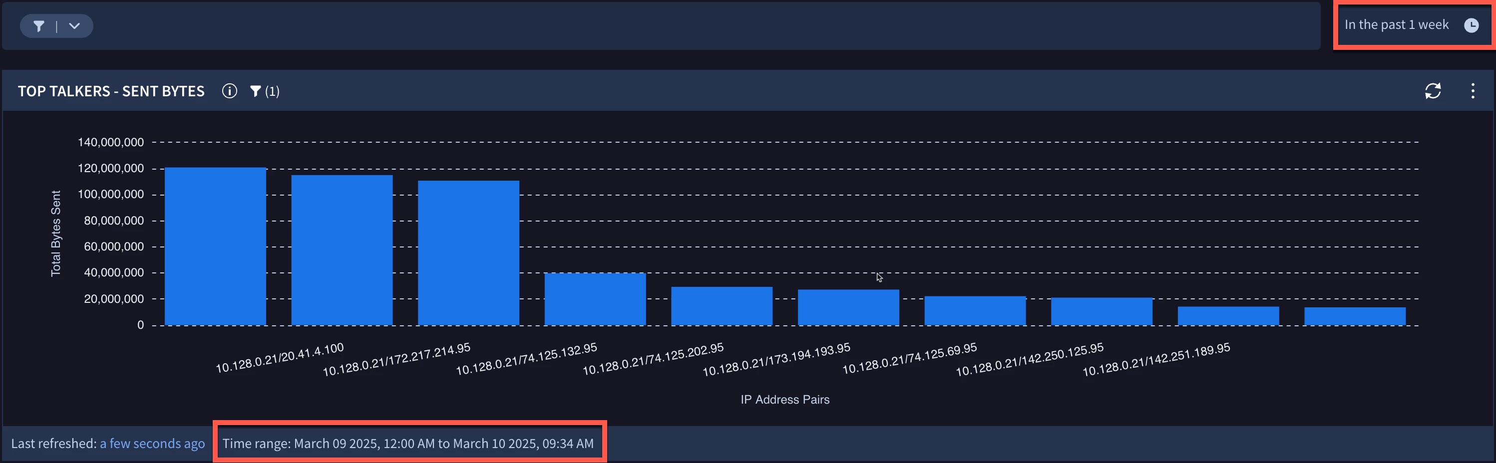
Finally, if you are a little nervous about this and are wondering what kinds of visual cues exist, it’s important to mention that at the bottom of each chart in a dashboard a time range is displayed. In my example above, I set the time range for the dashboard for the past 1 week. As we can see in my Top Talkers - Sent Bytes chart, the time range is displaying March 9 - 10, the start of the week being Sunday.
I hope this blog helps clarify relative time ranges and how time units are used. This can be very helpful to ensure that charts and dashboards provide the information a user is expecting to receive and will help you with the precision of these requests.