


Hi team,
I want to start by saying how much I appreciate the continuous effort from Google in adding more native dashboards to the platform. They are incredibly valuable for gaining visibility and insights into our security posture.
While recently exploring the "Case & Incident Analytics (SOAR)" dashboard, I noticed some unexpected behavior in the "Case Statistics" chart, which is designed to provide a "List of count of alert, cases, high priority cases, incident, high priority incident per month."
The Identified Issue
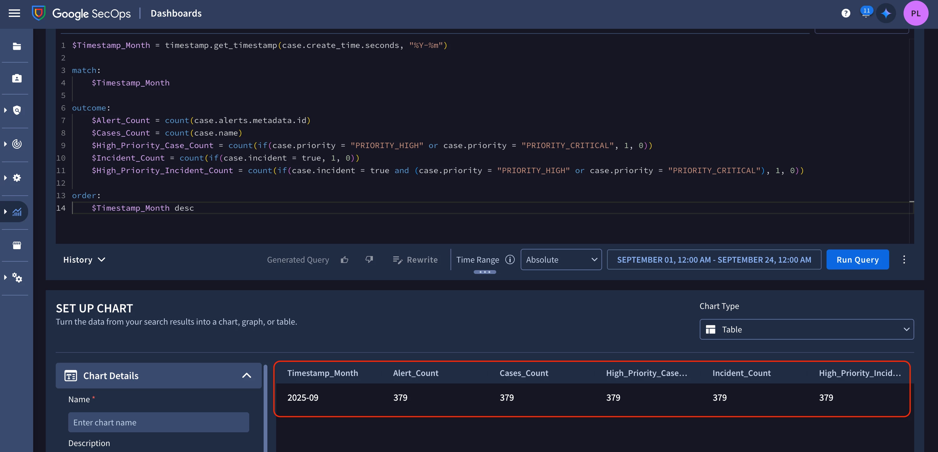
When running the default query for this chart, I observed that all the count columns (Alert_Count, Cases_Count, High_Priority_Case_Count, Incident_Count, and High_Priority_Incident_Count) were returning the exact same value.
Original Query:
$Timestamp_Month = timestamp.get_timestamp(case.create_time.seconds, "%Y-%m")

match:
    $Timestamp_Month

outcome:
    $Alert_Count = count(case.alerts.metadata.id)
    $Cases_Count = count(case.name)
    $High_Priority_Case_Count = count(if(case.priority = "PRIORITY_HIGH" or case.priority = "PRIORITY_CRITICAL", 1, 0))
    $Incident_Count = count(if(case.incident = true, 1, 0))
    $High_Priority_Incident_Count = count(if(case.incident = true and (case.priority = "PRIORITY_HIGH" or case.priority = "PRIORITY_CRITICAL"), 1, 0))

order:
    $Timestamp_Month desc
The issue appears to stem from how the count() function is used for the conditional metrics.
The Proposed Fix
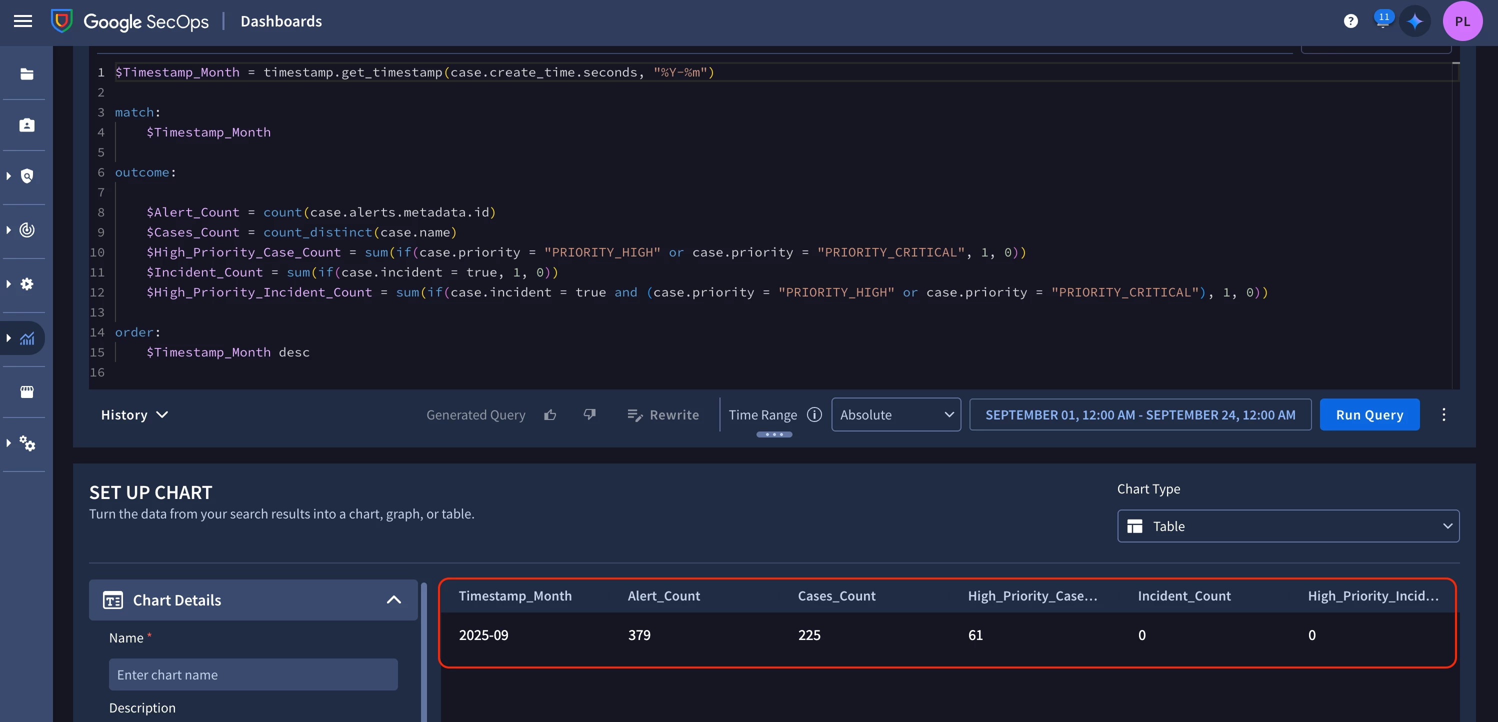
To address this and ensure the data accurately reflects our environment, I adjusted the query. I replaced count() with count_distinct() for the cases and used sum() for the conditional counts.
New Query:
$Timestamp_Month = timestamp.get_timestamp(case.create_time.seconds, "%Y-%m")

match:
    $Timestamp_Month

outcome:

    $Alert_Count = count(case.alerts.metadata.id)
    $Cases_Count = count_distinct(case.name)
    $High_Priority_Case_Count = sum(if(case.priority = "PRIORITY_HIGH" or case.priority = "PRIORITY_CRITICAL", 1, 0))
    $Incident_Count = sum(if(case.incident = true, 1, 0))
    $High_Priority_Incident_Count = sum(if(case.incident = true and (case.priority = "PRIORITY_HIGH" or case.priority = "PRIORITY_CRITICAL"), 1, 0))

order:
    $Timestamp_Month desc
After applying this change, the chart began to display distinct and more realistic values for each metric, providing a much clearer view of our case statistics.
Open for Discussion
I wanted to share this analysis with the community and the Google SecOps team for feedback. Does this adjusted query seem like the correct and most effective way to achieve the intended visualization for this chart? Are there other functions or best practices that you would recommend for this scenario?
Any insights would be appreciated.
Thanks in advance!
