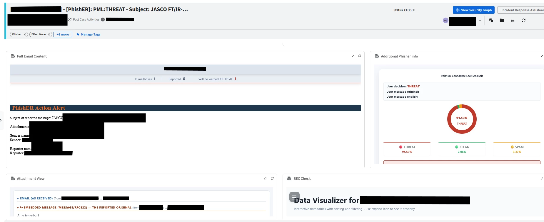

Introduction
When building custom HTML views in Google SecOps, one common challenge is making embedded content adapt to the application's current visual theme.
A custom HTML view may look perfectly fine in light mode but become difficult to read when the surrounding application switches to dark mode. Hardcoded backgrounds, text colors, and link styles can create visual inconsistencies and reduce readability.
Fortunately, a small JavaScript and CSS addition can make an HTML view respond dynamically to theme changes and, where supported, synchronize its appearance with the background color provided by the parent application.
How does it work?
The solution combines three mechanisms:
-
System theme detection — Uses
prefers-color-schemeto detect the user's operating-system preference as an initial fallback. -
Parent-window communication — Listens for messages from the parent window containing a background color, allowing the embedded view to infer whether the surrounding interface is light or dark.
-
Dynamic CSS styling — Applies a
data-themeattribute to the root HTML element and uses CSS rules to update the page background, text, and link colors.
This approach allows a custom HTML view to adapt without having to maintain separate light-mode and dark-mode versions.
1. Add the theme detection script
Add the following script to your HTML view:
<script>
(function () {
 if (window.__secopsTheme) return;
 window.__secopsTheme = 1;

 var root = document.documentElement;
 var media = window.matchMedia(
 '(prefers-color-scheme: dark)'
 );
 var parentThemeReceived = false;

 function setTheme(theme, background) {
 root.setAttribute('data-theme', theme);

 if (background) {
 root.style.setProperty(
 '--page-bg',
 theme === 'dark' ? '#212a39' : background
 );
 }
 }

 function getLuminance(color) {
 var canvas = document.createElement('canvas');
 var ctx = canvas.getContext('2d');

 if (
 !ctx ||
 !window.CSS ||
 !CSS.supports('color', color)
 ) {
 return null;
 }

 ctx.fillStyle = color;
 ctx.fillRect(0, 0, 1, 1);

 var rgba = ctx.getImageData(0, 0, 1, 1).data;

 if (rgba[3] < 255) return null;

 return (
 0.2126 * rgba[0] +
 0.7152 * rgba[1] +
 0.0722 * rgba[2]
 );
 }

 function applySystemTheme() {
 if (!parentThemeReceived) {
 setTheme(media.matches ? 'dark' : 'light');
 }
 }

 applySystemTheme();

 if (media.addEventListener) {
 media.addEventListener('change', applySystemTheme);
 }

 window.addEventListener('message', function (event) {
 if (
 event.source !== window.parent ||
 !event.data ||
 typeof event.data !== 'object'
 ) {
 return;
 }

 var luminance = getLuminance(
 event.data.background
 );

 if (luminance === null) return;

 parentThemeReceived = true;

 setTheme(
 luminance < 140 ? 'dark' : 'light',
 event.data.background
 );
 });
})();
</script>
The script first applies the system preference. If it receives a valid background color from the parent window, it uses that color to determine the theme instead.
The luminance threshold is a practical heuristic rather than a formal accessibility measurement. The background color is used as an indicator of the surrounding theme, not as a complete representation of the host application's styling.
2. Add the CSS rules
The JavaScript sets the data-theme attribute. The CSS defines how the HTML view should look in each mode.
<style>
:root[data-theme="light"] {
 color-scheme: light;
}

:root[data-theme="dark"] {
 color-scheme: dark;
}

:where(body) {
 background-color: var(--page-bg, transparent);
}

:where(:root[data-theme="dark"]) :where(body) {
 background-color: #212a39;
 color: #f3f4f6;
}

:where(:root[data-theme="dark"]) :where(a) {
 color: #8fb4f0;
}
</style>
These rules provide the basic theme adaptation:
-
Dark mode uses a dark blue-gray background and light text.
-
Links become light blue to remain visible against the dark background.
-
The
color-schemeproperty helps browser-native controls, such as form elements, use the appropriate color scheme. -
The
--page-bgCSS variable allows the background to be configured dynamically.
The :where() selector keeps specificity low, making it easier to override these styles when necessary.
3. Apply the theme to your own components
Changing the body background and text color is only the first step. Custom components with hardcoded colors may still look incorrect.
For a more maintainable implementation, define theme variables and use them throughout your HTML view:
<style>
:root {
 --surface: #ffffff;
 --text: #202124;
 --border: #dadce0;
 --accent: #1a73e8;
}

:root[data-theme="dark"] {
 --surface: #212a39;
 --text: #f3f4f6;
 --border: #465064;
 --accent: #8fb4f0;
}

body {
 background: var(--page-bg, var(--surface));
 color: var(--text);
}

.panel,
.card,
table {
 background-color: var(--surface);
 color: var(--text);
 border-color: var(--border);
}

a,
button.link {
 color: var(--accent);
}
</style>
This example can be extended to cover tables, input fields, navigation elements, status indicators, and other components in a custom HTML view.
The key principle is to avoid hardcoding colors throughout the interface. Instead, define a small set of theme variables and reference them consistently.
Conclusion
A small theme detection script, combined with CSS variables and theme-specific selectors, can make custom Google SecOps HTML views much more consistent with the surrounding interface.
The most important part is separating theme detection from component styling: JavaScript determines the active theme, while CSS variables define how the view should look.
This pattern is reusable across custom HTML views and helps avoid maintaining separate implementations for light and dark mode.
Our usage - we implement it in every HTML related views for every part - is there any other easier way to deliver the outcome?
Outcome
Before:
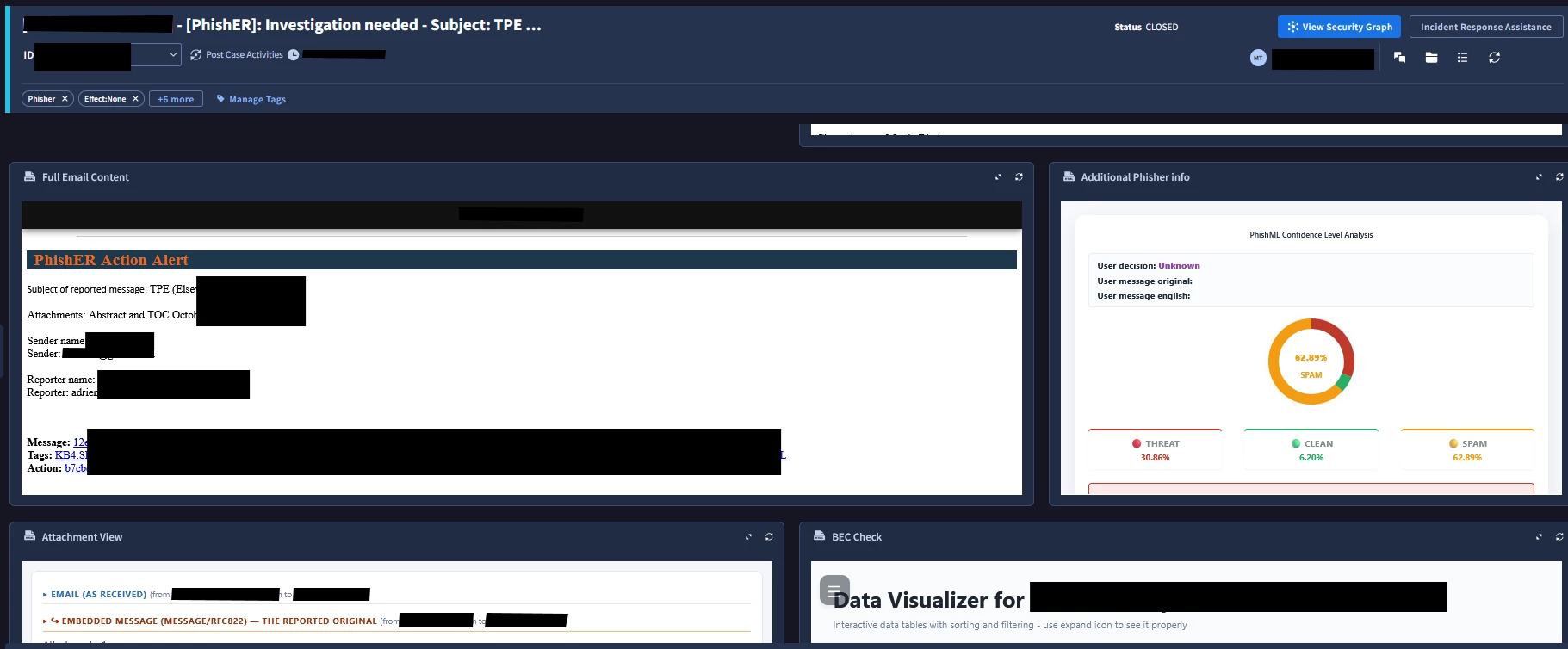
After Dark
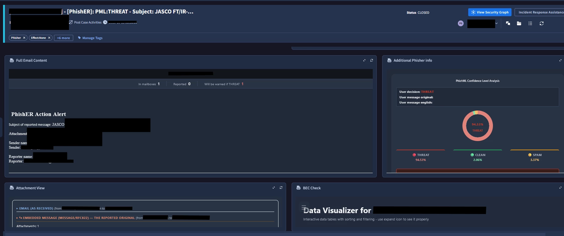
After Light