Question

Native dashboard New Chart Type Sankey

  • August 3, 2026
  • 2 replies
  • 12 views

Omskirt
Forum|alt.badge.img+7

I noticed a new native dashboard chart type called Sankey, but I haven't found any Google documentation for it yet. Could you elaborate on how to use it?

2 replies

cmorris
Staff
Forum|alt.badge.img+16
  • Staff
  • August 3, 2026

A Sankey chart is designed to visualize a "flow" from one category to another where the flow width is based on its weighting. You will need to specify your source and target nodes, as well as weight when setting the chart up.

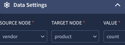
Source Node: Where the flow starts (ex. a user, an IP, or a component).

Target Node: Where the flow goes (ex. log type).

Weight: How thick the line should be (count).

Sample query:

$vendor = metadata.vendor_name
$product = metadata.product_name

match:
$vendor,$product
outcome:
$count = count_distinct(metadata.id)
order:
$count desc
limit:
10

Config:

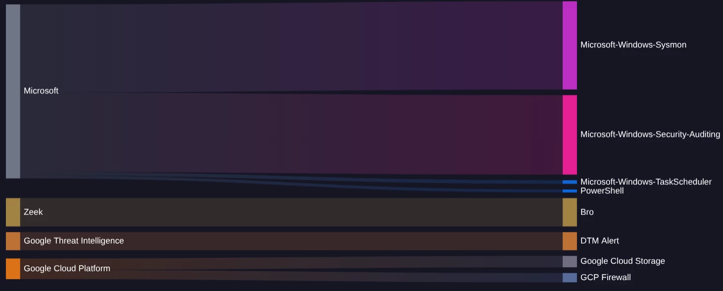
Result:

Note that for the Microsoft and GCP sources in my chart, the line splits into multiple targets on the right. The width of the lines as they split reflect the count of events - so I can visualize of my Microsoft logs, my PowerShell logs are much smaller than Sysmon, as an example.


kylechamplin
Staff
Forum|alt.badge.img+1

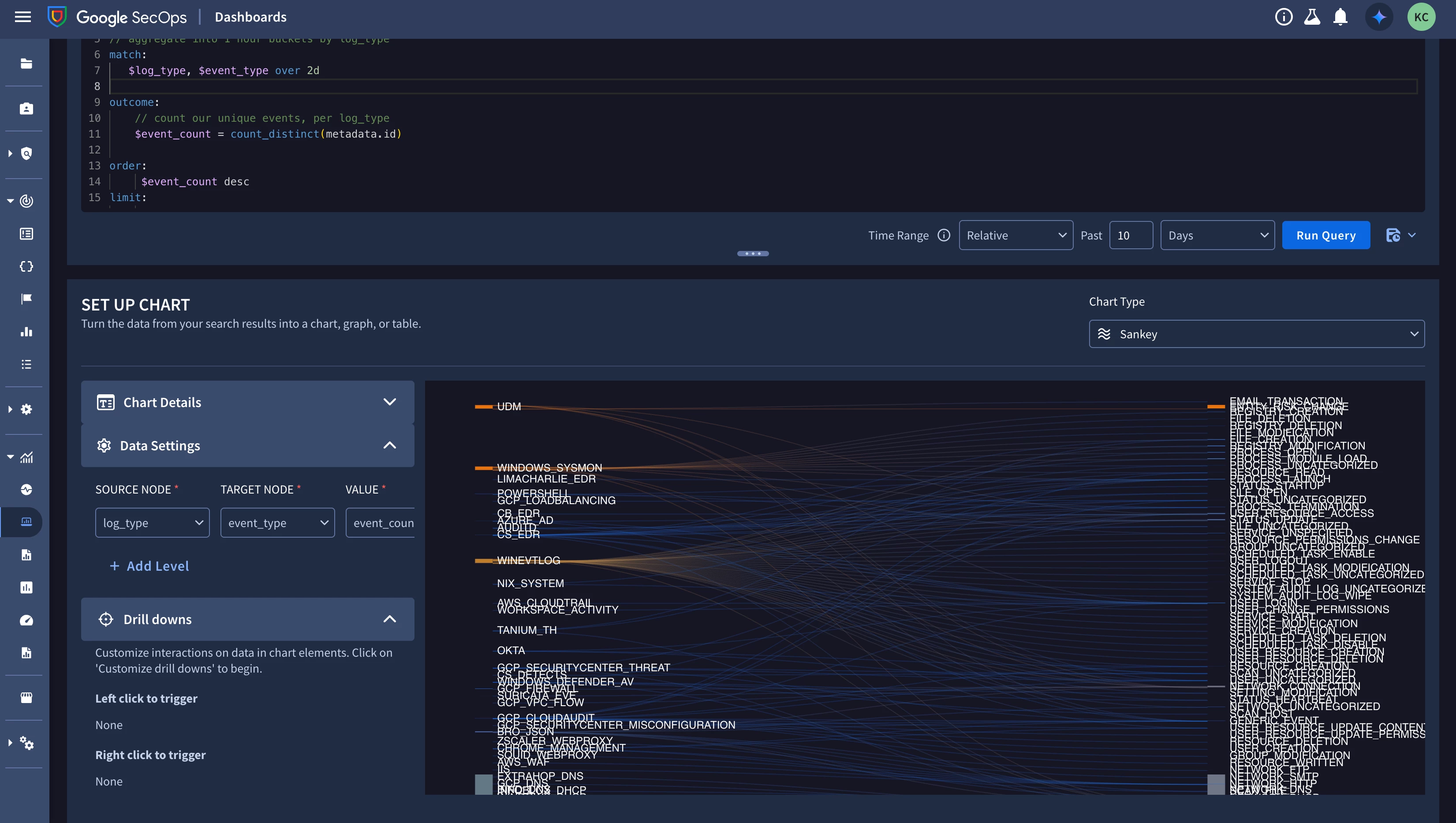
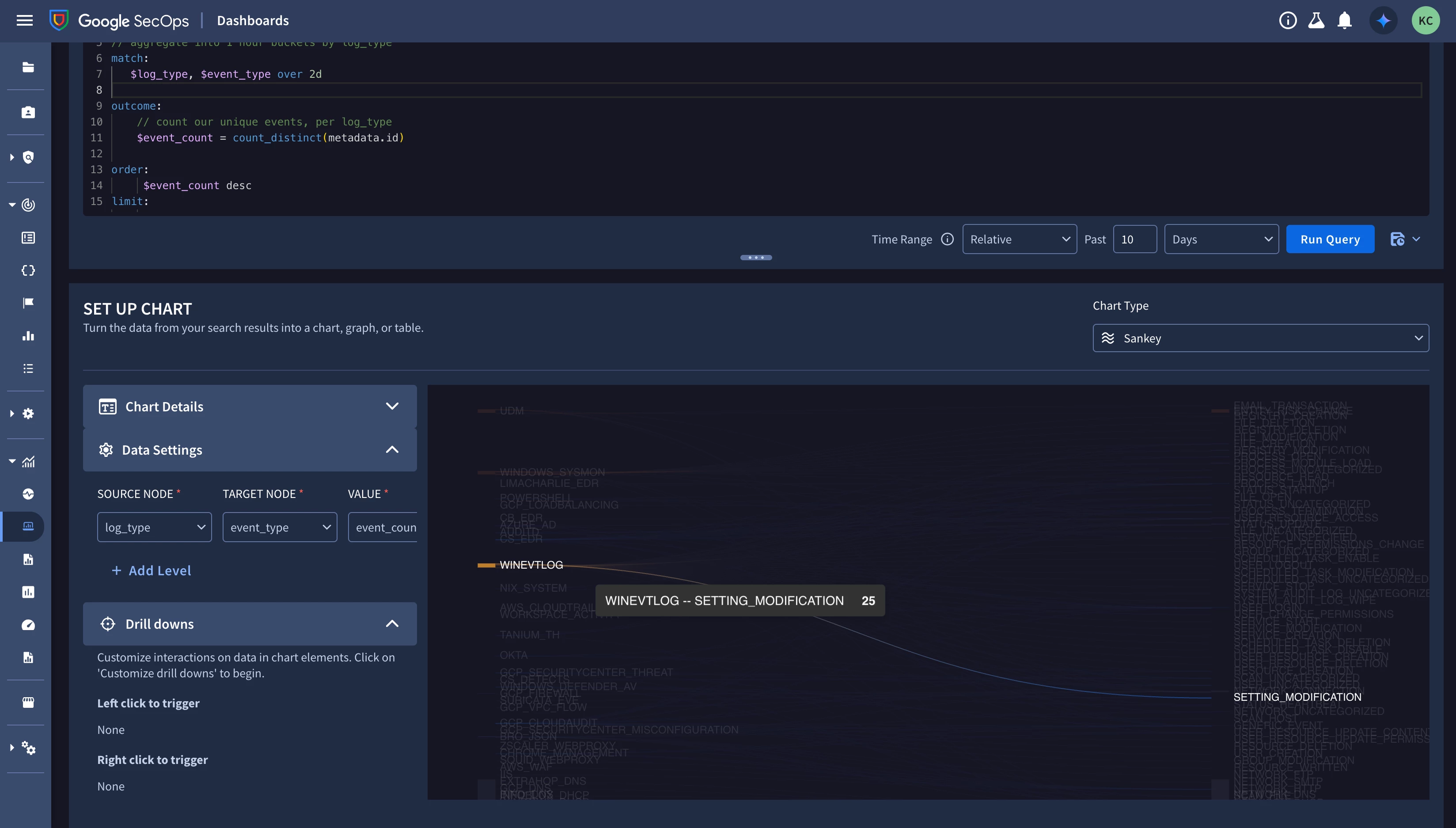
You should be able to aggregate on (at least) 3 variables to get this work (two match, and one outcome, to generalize). Here’s a naive example:

metadata.log_type != ""
$log_type = metadata.log_type
$event_type = metadata.event_type

// aggregate into 1 hour buckets by log_type
match:
$log_type, $event_type over 2d

outcome:
// count our unique events, per log_type
$event_count = count_distinct(metadata.id)

order:
$event_count desc
limit:
10000