
Hi Community,
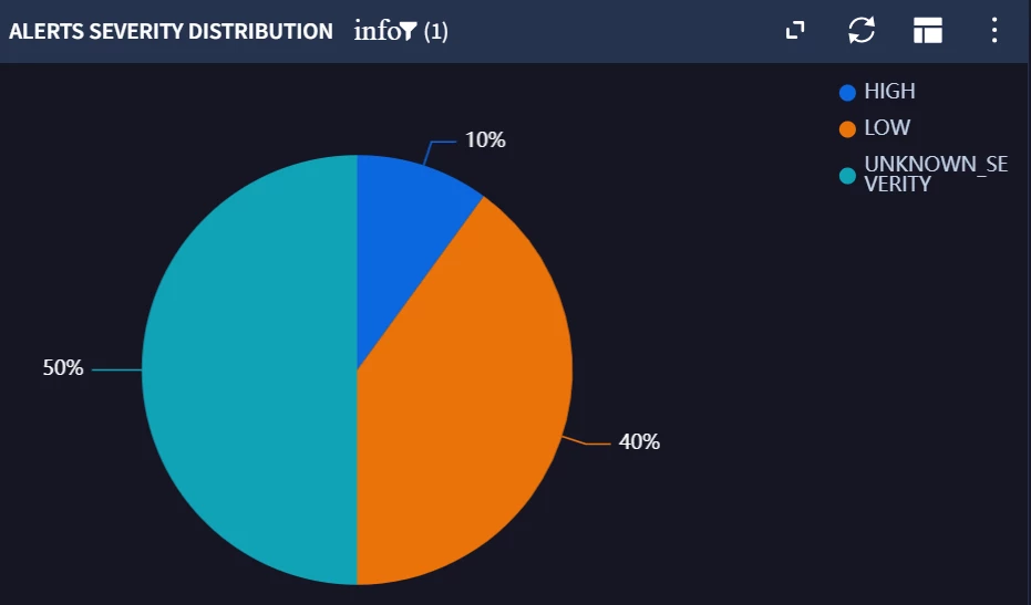
In Google SecOps (Dashboard pie chart), I’m visualizing Alerts Severity Distribution. The pie chart renders correctly and the legend shows the categories (e.g., HIGH, LOW, UNKNOWN_SEVERITY), but the slice data labels display only the percentage (10%, 40%, 50%) and do not include the category name (expected format like “10% High”).
Please check below:
Query used:
metadata.log_type = "MICROSOFT_GRAPH_ALERT"
metadata.product_name = "Office 365 Security and Compliance"
security_result.summary = /threat(?:\s)?management/ nocase
$Severity = security_result.severity
match:
$Severity
outcome:
$Count = count(metadata.id)
order:
$Severity desc
