Question

Google SecOps Dashboard – Multiple Metrics in a Single Line Graph

  • July 8, 2026
  • 3 replies
  • 65 views

melissagr
Forum|alt.badge.img+3

Hey everyone, 

Can a Google SecOps Line Graph display multiple metrics (different numeric fields) in the same chart, or is it limited to a single Y-axis metric?

For example, if my query returns:

  • Date
  • Hostname
  • Current_Usage
  • Historical_Average
  • Historical_Threshold

Can a single Line Graph plot the three numeric fields (Current_Usage, Historical_Average, and Historical_Threshold) as three separate colored lines over time, or is one Line Graph limited to only one numeric field?
Thank you ^.^


3 replies

hliu
Forum|alt.badge.img+5
  • Bronze 2
  • July 9, 2026

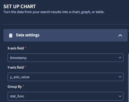
As far as I know, Secops dashboard offers only
1 single field for X-axis
1 single field for Y-axis
1 single field for groupby


which means we won't be able to directly plot all the statistical aggregation functions if they are presented as separated fields, e.g.

time | groupby_field (i.e. hostname) | count | avg | std_dev | other functions...
2026-07-08 | host1 | 2 | 3 | 4 | etc...
2026-07-09 | host2 | 7 | 8 | 9 | etc...


If by any chance you are willing to sacrifice or don't need the original grouby field (for example the hostname field),
then it'd be possible to plot the 3 statistical aggregation functions as different lines if the data can be refactored as:

time | groupby_field (statistical_function) | y-axis
2026-07-08 | current_usage | 3
2026-07-08 | historical_average | 2
2026-07-08 | historical_threshold | 5
2026-07-09 | current_usage | 4
2026-07-09 | historical_average | 3
2026-07-09 | historical_threshold | 6
etc

above format is often found on metrics data. Depending on the case, it might require conditional format the data or even re-factoring using stages.


If the split-by (hostname) is needed, then you could try to add it with a string.concat:
$groupby_field=strings.concat(hostname,"-",statistical_function)

time | groupby_field | y-axis
2026-07-08 | host1-current_usage | 3
2026-07-08 | host1-historical_average | 2
2026-07-08 | host1-historical_threshold | 5
2026-07-08 | host2-current_usage | 4
2026-07-08 | host2-historical_average | 7
2026-07-08 | host2-historical_threshold | 8
etc.


Few additional feature gaps to consider:
-Although secops offers the possibility to display axis in log scale, AFAIK it doesn't allow dual Y-axes nor chart overlay.
-Beware the non-linear X-axis bug.


hope any of the above could help, but it is true that Secops’ dashboarding capabilities are … very spartan compared to the competition.


melissagr
Forum|alt.badge.img+3
  • Author
  • Bronze 5
  • July 10, 2026

@hliu 
 

Thank you so much, that's very helpful.

Could you elaborate on what you mean by "refactoring using stages"?

Is there any way in Dashboard Search to reshape

 
Date | Hostname | Current | Average | Threshold

into

 
Date | Metric | Value

using stages?


hliu
Forum|alt.badge.img+5
  • Bronze 2
  • July 10, 2026

I was thinking on using stages to calculate the metrics separately and then append them in the root stage, to achieve having the metrics in different rows.
But it looks like the append operation is not available. Although an outer join operation is possible, it’s either left or right: full outer join (left join and right join together) is not supported. So stages looks like a dead-end.

I couldn’t find any feature to unpivot or transpose the dataset, either.

We are facing here several gaps in the product: in the dashboarding department as well as in the data preparation.

Maybe someone from Google could let us know if there’s any plan to implement the feature of selecting multiple fields for the Y-axis.